您现在的位置是:首页 >技术交流 >diy-table(开箱即用)网站首页技术交流
diy-table(开箱即用)
简介diy-table(开箱即用)
此自定义表格组件基于 Vue 3 和 ElementPlus 组件库开发,提供一个易于定制的表格解决方案。
表格具备表头和表格数据展示功能,支持表头点击和行点击事件,同时可根据列定义动态生成表格内容,并能添加 tooltip 提示信息。
技术栈:Vue3+JavaScript+element-plus。
目录
使用方式
<template>
<div>
<DiyTable
:data="tableData"
:columns="tableColumns"
@select-change="handleSelectChange"
/>
</div>
</template>
<script setup>
import { ref } from "vue";
import DiyTable from "@/components/common/diy-table/index.vue";
// 示例数据
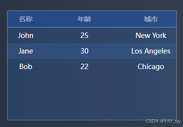
const tableData = ref([
{ name: "John", age: 25, city: "New York" },
{ name: "Jane", age: 30, city: "Los Angeles" },
{ name: "Bob", age: 22, city: "Chicago" },
]);
// 示例列定义
const tableColumns = ref([
{
prop: "name",
label: "名称",
width: "20%",
tooltip: (item) => `This is ${item.name}'s name`,
},
{ prop: "age", label: "年龄", width: "50%" },
{ prop: "city", label: "城市", width: "30%" },
]);
const handleSelectChange = (item) => {
console.log("选中的行数据:", item);
};
</script>
<style lang="less" scoped></style>
主要代码
<template>
    <div class="diy__table">
        <table>
            <thead>
                <tr>
                    <!-- 表头 -->
                    <th
                        v-for="column in columns"
                        :key="column.prop"
                        :style="{ width: column.width }"
                        @click="handleHeaderClick(column)"
                    >
                        {{ column.label }}
                    </th>
                </tr>
            </thead>
            <tbody align="center" valign="center">
                <!-- 表格数据 -->
                <tr
                    v-for="(item, index) in data"
                    :key="index"
                    :class="{ 'selected-row': selectedIndex === index }"
                    @click="handleRowClick(item)"
                >
                    <td
                        v-for="column in columns"
                        :key="column.prop"
                        :style="{ width: column.width }"
                    >
                        <!-- 如果 column 有 tooltip 属性,则添加 el-tooltip -->
                        <el-tooltip
                            v-if="column.tooltip"
                            :content="column.tooltip(item)"
                            placement="top"
                            effect="light"
                        >
                            <span>{{ item[column.prop] }}</span>
                        </el-tooltip>
                        <span v-else>{{ item[column.prop] }}</span>
                    </td>
                </tr>
            </tbody>
        </table>
    </div>
</template>

<script setup>
import { ref, defineProps, defineEmits } from "vue";
import { ElTooltip } from "element-plus"; // 引入 ElTooltip 组件

// 定义 props,接收父组件传递的数据和列定义
const props = defineProps({
    data: {
        type: Array, // 表格数据
        required: true,
    },
    columns: {
        type: Array, // 表格列定义
        required: true,
    },
});

// 定义一个响应式变量来存储当前选中的行索引
const selectedIndex = ref(-1);

// 定义事件
const emits = defineEmits(["select-change", "header-click"]);

// 处理行点击事件
const handleRowClick = (item) => {
    selectedIndex.value = props.data.indexOf(item);
    // 触发 select-change 事件并传递整个 item
    emits("select-change", item);
};

// 处理表头点击事件
const handleHeaderClick = (column) => {
    // 触发 header-click 事件并传递被点击的列信息
    emits("header-click", column);
};
</script>

<style scoped lang="less">
.diy__table {
    table {
        background: rgba(49, 92, 155, 0.2);
        border-radius: 4px 4px 4px 4px;
        border: 1px solid rgba(255, 255, 255, 0.2);
        box-shadow: 0px 1px 1px 0px rgba(0, 0, 0, 0.25);
        border-collapse: collapse;
        border-spacing: 0;
        margin: 0;
        padding: 0;
        th,
        td {
            padding: 0;
        }
        thead {
            display: table;
            width: 100%;
            table-layout: fixed;
            tr {
                margin: 0;
                padding: 0;
                th {
                    font-weight: 500;
                    font-size: 14px;
                    color: rgba(255, 255, 255, 0.6);
                    line-height: 20px;
                    background: rgba(0, 99, 255, 0.2);
                    padding: 6px;
                    white-space: nowrap;
                    border-bottom: 2px solid #5374a8;
                }
            }
        }

        tbody {
            display: block;
            height: 190px;
            overflow-y: auto;
            tr {
                display: table;
                width: 100%;
                font-weight: 500;
                font-size: 14px;
                color: #ffffff;
                line-height: 20px;
                table-layout: fixed;
                td {
                    padding: 6px;
                }
            }
            tr:nth-child(even) {
                background: rgba(62, 127, 207, 0.2);
            }
            tr:nth-child(even).selected-row {
                background: rgba(52, 114, 212, 0.8);
            }
            // 选中行的样式
            .selected-row {
                background: rgba(52, 114, 212, 0.8);
            }
        }
        thead tr th {
            position: sticky;
            top: 0;
        }
    }
}
</style>
成果展示
风语者!平时喜欢研究各种技术,目前在从事后端开发工作,热爱生活、热爱工作。


站长推荐
- QT多线程的5种用法,通过使用线程解决UI主界面的耗时操作代码,防止界面卡死。
 QT多线程的5种用法,通过使用线程解决UI主界面的耗时操作代码,防止界面卡死。...
 - U8W/U8W-Mini使用与常见问题解决
 U8W/U8W-Mini使用与常见问题解决
 - stm32使用HAL库配置串口中断收发数据(保姆级教程)
 stm32使用HAL库配置串口中断收发数据(保姆级教程)
 - 分享几个国内免费的ChatGPT镜像网址(亲测有效)
 分享几个国内免费的ChatGPT镜像网址(亲测有效)
 - Allegro16.6差分等长设置及走线总结
 Allegro16.6差分等长设置及走线总结